Proper design of your figures is an important step towards successful science communication. In this blogpost, I want to provide you with the basics of colors and how to correctly use colors for plotting your results.
In the last blogpost, we talked briefly about uniform designs and how to easily replicate them with a template. Here, I want to give you a quick rundown about colors and how to use them to your advantage.
Why colors?
Colors in figures and plots serve multiple purposes. They generally improve the aesthetics, catching the readers eye. Think about a conference for instance. The posters with the most interaction are not always those with most interesting/relevant research, but can be the ones that grabbed your attention.
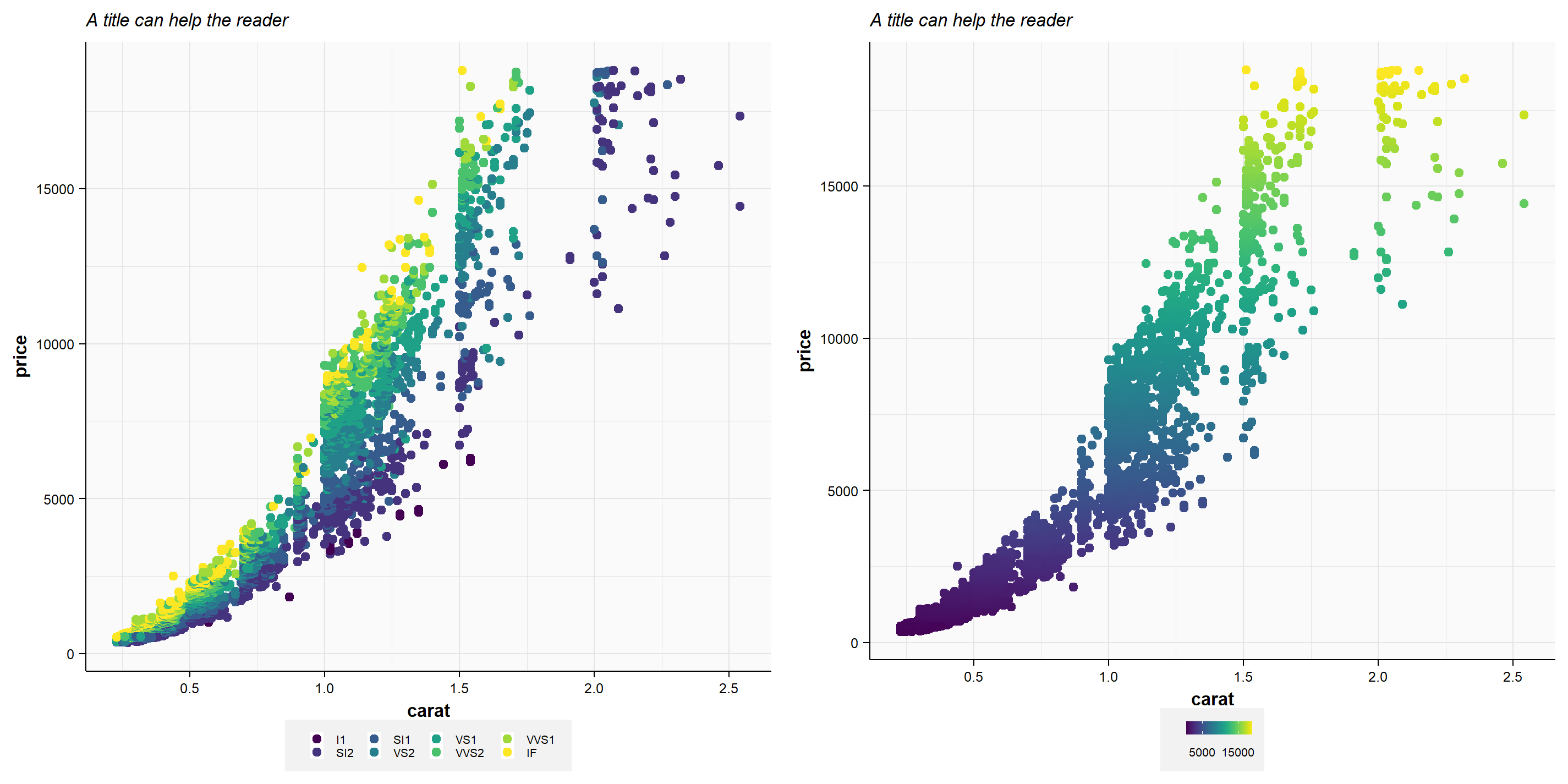
Most importantly, colors help you convey information that normally cannot be shown in 2-dimensional graphs. Displaying a third or fourth informational dimension can improve your own understanding of the underlying causes, thus help the reader as well. Think back to our last post about the diamond prices based on their carat value and cut quality (Figure 1a). You can easily see that lots of the variability in price does not come from the carat of the diamond, but from the cut quality of the gems. But both variables are important to understand a diamonds value. It would be chaos trying to differentiate the cut quality if you used symbols instead of colors.
While conveying information is the primary goal of colors in plots, doing the opposite (duplicating information) is the biggest don`t. In Figure 1b you can see that colors are simply used based on the diamonds price (displayed on the y-axis). While you may think that it looks pretty, it is something that I would refrain from doing. It’s unnecessary or at worst the reader thinks there is a third variable being displayed here, whilst in reality it is still only a basic x-y scatterplot.
Lastly, colors enable you to improve the readability or interpretability of your results, highlighting key differences. In these cases, the color may not convey any specific information but contrasts well with the underlying figure. Think of microscopy photos where black or white font colors would be hard to read.
How are colors represented?
We will not be getting into the nitty-gritty of color spaces to keep this post brief. But you are probably familiar with one color space: RGB. RGB stands for “red, green, blue” which are the three color channels that can produce different colors when mixed. Mixing blue and red gives you violet, for instance. RGB is commonly used in all forms of electronics; your smartphone, your TV, your monitor. Thus, RGB is ubiquitous in our daily lives. When we talk about RGB, we commonly refer to 8bit-RGB, which means every color channel (e.g., red) is 8bit wide. Therefore, it can have 256 different values (2^8 = 256). As a result, we can have 255 different shades of red and 1 shade being completely free of any red. This means that we can have ~16.7 million different colors, because we have 256 × 256 × 256 shades of red, green, and blue.
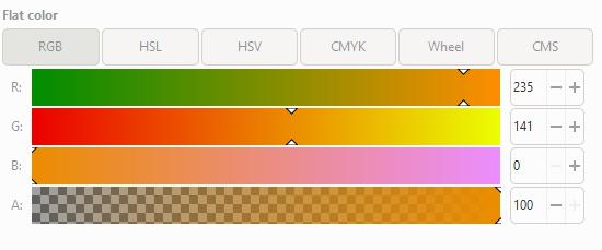
Here is an example of an orange color (Figure 2). It consists of a high-intensity red (R = 235), a medium-intensity green (G = 141) and no blue tint (B = 0). You may also see that there is a forth channel we haven’t talked about. The A-channel stands for the Alpha-channel and describes the opacity of your color. The opacity regulates how much other underlying colors can “shine-through” or mix with your color. If you have an alpha of 100% (opacity = 0%) then no other color can shine through. At 50% alpha (opacity = 50%), half of the underlying colors can shine through. But remember, not all picture types support an alpha-channel. For instance, photos that you oftentimes store as .jpg-files do not have an alpha-channel. PNGs (Portable Network Graphics), however, support RBGA channels. So, if you want to create a nice figure for your next presentation, where the background color can shine through, then you should use the PNG format.
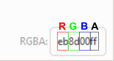
One more key aspect of any color space is the ability to exactly recreate your color of choice. Using the example above, if you go into any graphics program and fill in the RGB values then you will get the same orange color again. Even better, you will always find a shortcode (hex-code) that you can copy and paste. For the orange color it would be eb8d00ff (Figure 3). Every two characters represent one color channel (RGB). The last two characters in this example (“ff”) represent the alpha-channel (A), thus you know this is an RGBA code, because it has 8, not 6, characters. Use these color codes to you advantage, for instance in R you can clearly define colors over and over again.
Which colors?
I would not say that there are strict rules to which colors can or cannot be used. However, when it comes to publishing there is oftentimes the requirement of not using yellow tones. They are generally hard to read or see and this issue mainly stems from times were journals were actually printed. This rule has become outdated and you see more and more yellow colors used. Still, if you can work around using yellow as a color, then I would still recommend it. In some cases, I would also encourage the use of yellow and that is when working with continuous color gradients. For instance if you want to display the difference between “good” and “bad“, using a green to yellow to red gradient (GrYlRd). This is a very intuitive color scale due to most people being familiar with traffic lights.
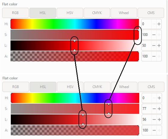
But enough about yellow. There are also certain tones that I would not recommend. Mainly pure, high-saturation colors. Here is an example of a pure red (R = 255, no green, no blue) versus a red that is slightly desaturated and with a little bit higher lightness (Figure 4).
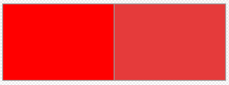
The pure red is rather aggressive and if you add further pure or high-saturation colors, then the color composition may resemble what some call “kids-drawings”. The less-saturated and higher-lightness red is easier on the eyes and appears generally more balanced. If you want to change the lightness and saturation of your colors, then in most graphics programs you will find “HSL” besides your RGB color values. HSL stands for (you guessed it): Hue, Saturation, and Lightness. Most programs also offer HSV options, which can be more intuitive to use and allow you to obtain similar results. Both are recommendable.
My general tip would be to use slightly desaturated colors and maybe increase their lightness as well (see Figure 5). In some cases, when you increase the lightness further, then you are moving into the pastel color room, which can be very visually pleasing. Pastel colors are also a great choice for flow-charts, schematics or diagrams, where colors are used to distinguish shapes but are not supposed to be dominant.
How many colors?
Oftentimes as you want to color different treatments or groups, you may be faced with the difficult task of multiple discrete colors that are still distinguishable. The general rule of thumb is that it is hard to create color scales with more than 8 clearly distinguishable colors. At such a point, you should also critically re-evaluate if it makes sense trying to show more than 8 distinct groups. In most, if not all cases, showing more than 8 different groups in a single graph will result in spam and the reader will be unable to grasp your message.
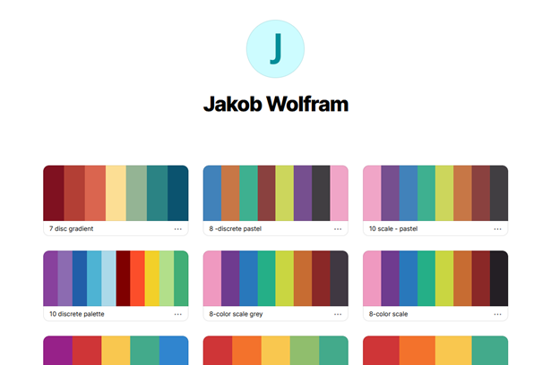
To give you something to start out, I have added my coolors.co profile (see Figure 6). Coolors.co is a great site that enables you to browse through various user-creating color scales. It also helps the user to define or even randomly-generate one’s own color scales. I used the website to save most of my personal color palettes, some of which that I also used for my recent publications. If you click on any color that interests you then the RGB string is automatically copied and you can paste that color in any graphics programs.
One final tip, if you want to increase the number of distinct colors. You can always try to double the size of your color palette if you create a high-lightness variant of the original color. In the example below (Figure 7), you can see a reddish brown (L = 35) and its high-lightness counterpart (L = 55). However, be aware that the high-lightness colors can also become difficult to distinguish from other colors in your palette, so this is not a fail-proof solution.

Those are the basics for now. I hope you got a little better idea on using colors for plotting results. If you have interesting color scales, feel free to share them with me.
Jakob Wolfram is part of the MAGIC research group. The group focusses on large spatio-temporal assessments of chemicals impacts on the environment.